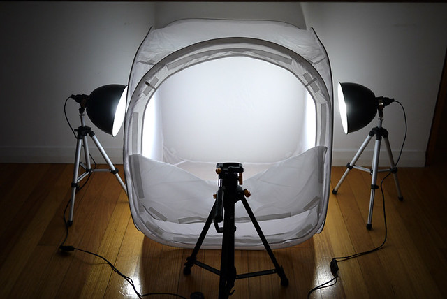
The products for Modern Pet (a business I’m running with my sister and our other halves) are slowly coming in and we’ve just bought a cheap eBay light tent set-up to help with the product shots.

80cm light tent and lights all delivered for $130. The lights are awesome but the tent itself isn’t as white as I thought it would be, a little too thin, so thin that you can actually see the wooden floor through the tent.

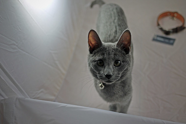
My little assistant Mia couldn’t help but jump straight into the tent!

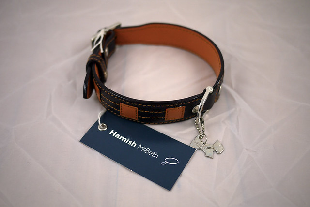
So here’s a shot un-edited. It’s not bad actually. With a more solid white floor under the products it should be a lot better (I’m thinking just white carboard will do).

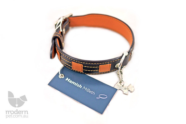
And here’s a shot very roughly edited in Photoshop. No amount of levels/curves was going to work completely. I had to literally erase a lot of the shadow work by hand. I timed myself on this and it took me 10 minutes.

I used the same light tent for my portfolio. I opted for the black vs white as it provided better results. It’s not a bad wee setup ay? The white balance seems a tad off though on the photoshopped image….but what can you do?
Well worth the effort in the end i say. Have fun!
Hey Justin, just a few things. give the inside a quick iron, just make sure you put a cloth there and then iron :).
Also put paper underneath the tent, works perfectly. Or try to put white fabric underneath if you feel like doing that, use a thick white fabric. It eliminates the transparency very well.
Tent looks good, just put some poster board on the bottom and back and it should be good!