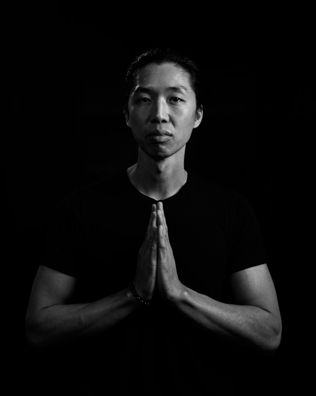
Cancer survivor Leslie Lau of Finding Space.
Shot by Nick in our studio, edit by me. @spacewalkagency

Cancer survivor Leslie Lau of Finding Space.
Shot by Nick in our studio, edit by me. @spacewalkagency
Wild night with Marta, an American model signed with CW Management, Elite Miami, Freedom Models LA, Premier Models London and Priscillas Australia. She came with a stylist to use our studio to shoot 3 male models. Fun times! Dianne took some BTS shots, I’ll go through them and post some up soon!
Today we did an eCommerce shoot for No Saints, vegan sneakers that are ethically made with premium materials, causing zero harm to animals, people and the environment.
The shots are looking sharp AF. Look out for them on the No Saints web site soon!
Visit: https://nosaints.co
New set with Viv & Friend shot at the top floor of The Shangri-La Hotel now making it’s way to both my Patreon and Viv’s Patreon too.
Most of this set would get me banned on social media simply due to nudity, sincerely pisses me off as some of these shots are super artistic and I’d love to share them.
New set of Viv & Kammy shot at The Establishment are up on my Patreon! Visit: https://www.patreon.com/justinfoxphoto
Huge energy, high BPM! Spacewalk shoot for F45 Training Kensington done and dusted!
Nick and I were at F45 Training Kensington early Saturday morning to cover their official Studio-Warming event. The space had pretty tough lighting conditions (which always makes me a little nervous as I’m most comfortable shooting in natural light) with a combination of some harsh natural light on one side, tinted from the other, and fluorescent lights casting a green/yellow glow from above, but we made it work!
The room itself was packed, and there wasn’t much room for us between work stations. Everyone was wearing something different and doing something different every 45 seconds, so the synchronised shots I had in mind were quickly thrown out the window. Instead I chose to focus on soaking up the energy in the room, and amongst the chaos, be still and try to frame dynamic moments.
F45 felt more like a community than other “gyms”. No egos, no judgement, and it looked like every single person there got their sweat on, that’s for sure!
We (Spacewalk) are supplying F45 Training Kensington with shots, and short videos too, all of which will fuel their social media. Follow them: @f45_training_kensington
Just a little shout out.
I love people that re-invent themselves. At times I’ve had girls ask me to take down photos I’ve taken of them as they’re moving on in life. It’s never been an issue. My photos are theirs, and I’m always happy to remove them.
I’ve shot with Cara a fair few times, she was a wild one! A few months back she reached out to me to take down her photosets as she was trying to start up a new business.
Our recent conversations have been all about finding peace and joy, and within just a few months she’s already launched her new beauty salon (hey I need to get my teeth whitened!).
Visit: Lucid Beauty
Little video that Nick made. I love it!
Just a few BTS shots from yesterday’s E-commerce shoot for Powrbox Boxing.
For the hungry and undefeated. Powrbox Boxing is run by Bryce Cryer (a boxer himself, so you know it’s legit). He’s launching a new premium professional boxing equipment and apparel brand and got in touch with us (Spacewalk) to shoot his products for his upcoming web store.
We’re shooting e-com product shots, but also found the right male model (Chris, who’s also a boxer. Legit x 2!) to model the gear too.
Follow: @powrboxx