Category Archives: Design

The future of Australian INfront

7104467753_2f50fc9a55_z

8248207545_8a7917a95b_z

totebags-640x427

6958400876_8c8ea9a828_z

DSC2780-602x401

audience-640x427

6844288663_633d658fa3_z

7137828523_bacc092bfc_z

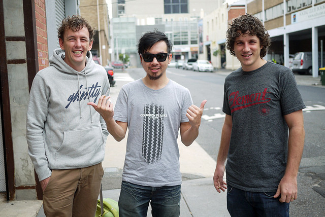
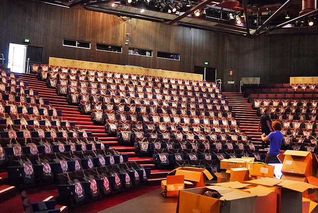
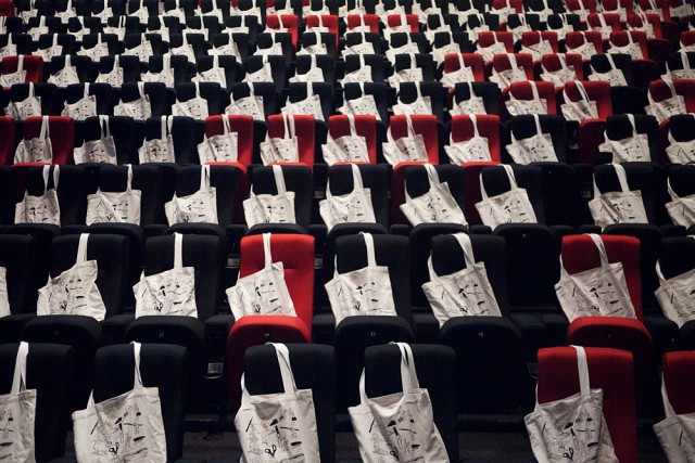
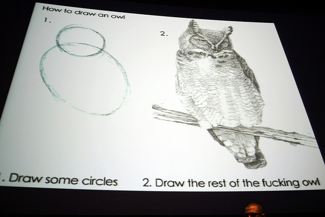
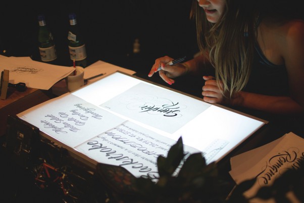
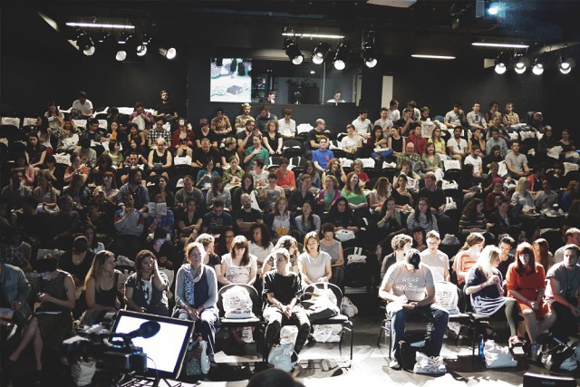
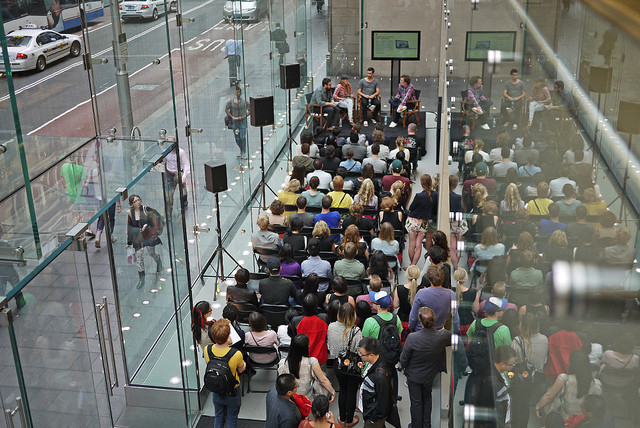
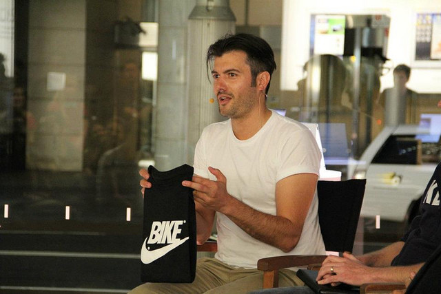
Discussions soon with my current Australian Infront business partners Damien and Zann. Are we going to put more energy into it, or is our work done? Since 1999 the Australian INfront has worked hard to inspire a community of Australian creatives to take inspiration from our own backyards instead of simply looking overseas to make it. Here are a few photos of Damien, Zann and I at work. It might be another lifetime ago for me, but INfront moments, including all who were the original founders with me back in 1999 are special moments.

Our work is done – Australian INfront – 1999-2019.

Visit: http://www.australianinfront.com.au

Posted in Design | Leave a comment

Shooting the shit with Seany Tee

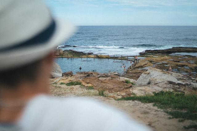
seantorstensson_justinfox_mahonpool_1

seantorstensson_justinfox_mahonpool_0

seantorstensson_justinfox_mahonpool_3

seantorstensson_justinfox_mahonpool_4

I caught up with old Graphic Design mate Sean Torstensson yesterday, we’ve been friends since I launched the Australian INfront in the late 90’s. Sean was a founding member and he was on the stage beside me when we presented INfront at Semi-Permanent too.

Sean’s always been the young picture of potential to me, but over the years I felt the kid needed to pull his thumb out of his bum and turn attitude into genuine confidence. I’m sure I deal “tough love” harder than most, so I know Sean’s copped it hard from me over many years… funny then that even after all these years I find myself once again kicking him in the bum!

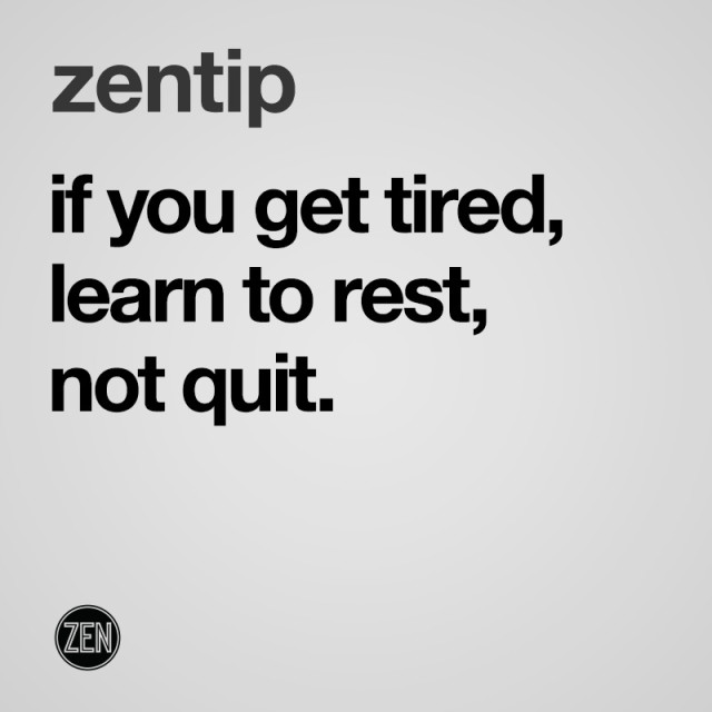
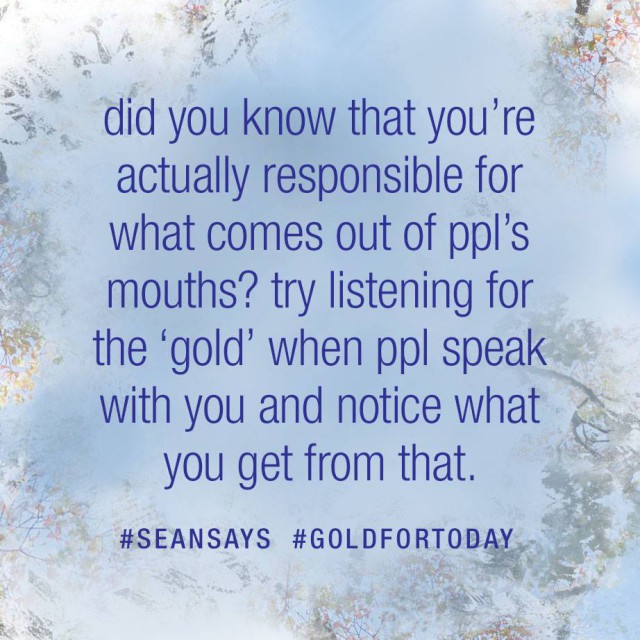
One of Sean’s inspirational quotes came up on my feed and I lost my shit:

51043317_10155593523647126_5154396952078581760_n (1)

I wrote in response: I’m in NO WAY AT ALL responsible for what comes out of other PEOPLES (why ppl?!) mouths Sean! I say everyone should take more responsibility for what comes out of their mouths, no? Your quote is in 2 parts, first part is hella confusing, 2nd part is pretty logical. IE: listen to people, if you do you might find greatness (also, why use the money related term of ‘gold’ here Sean? Very curious as to why people’s good words need to be associated with money?).

Sean dodged my response, which really took me by surprise (you can check the to-and-fro post responses here. After much blasting was done Sean thought it would be better to catch up in real life instead of Facebook. I agreed and yesterday I gave it to him even harder, no filter.

“As a Designer you’re a communicator Sean and you should know better than to completely confuse, or in this case, misuse words for no good reason. There’s nothing left-of-field about the first part of the quote, it represents victim blaming! You gotta stop caring for the fans who just put love hearts under every post and understand that the people who have taken the time to write long constructive posts are the real fans… and WTF you still using this light blue flowers background shit since the late 90’s?!” etc etc.

Amazingly Sean sat there with a grin on his face and just deflected the lot with “well that’s your opinion Justin”.

I give up! In the words of the great Elon Musk: “If you can’t beat them, join them!”. Sometimes acceptance might be the only way forwards? Less expectations, more rock pool.

Posted in Design, Photography | Leave a comment

Blast from the past


Blast from the past! Shot in 2006, thanks Martin Bierschenk for the memories!

Posted in Design, House | Leave a comment

Bionic

justinfox3

Designed as a cover for a magazine a few mates and I tried to get funded by the publishers of Rolling Stone magazine. We got close, we scored a deal to launch the magazine but had to work from their offices, not mine, so we let it go. Regrets? Kinda wish we at least gave it a go.

PS: Have had someone mail me about her penis, and was so into it that she wanted to use it to present to a group of political dingbats. I’m like… what penis?!!!!!!!!

Posted in Design | Leave a comment

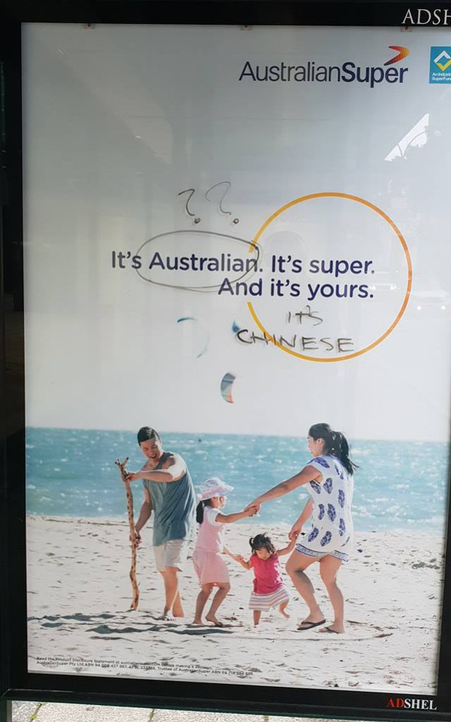
How is this poster racist?!

australiansuper
Fact: Australia has one of the world’s largest superannuation pools.

Morgan Freeman maintained the way to get rid of racism was to “stop talking about it.”. OK, so I’m talking about it; but it’s hard not to when you see corporate advertisements like this. Discuss (or disgust?!).

Posted in Design, Spam | Leave a comment

Yes I was in a SAVAGE GARDEN music video


That’s me putting on the gas mask.

Funny story time!

I used to dress pretty punk at my first design job. I was asked by the agency next door to where I worked if I’d be interested in being in a rock clip for a band called SAVAGE GARDEN. The guys said I could come exactly as I was, and I thought “Hmmm, Savage Garden sounds kinda like SOUNDGARDEN so OK, why not!”.

We shot all day and were fed pizzas for lunch. During the break, the baddest dude there (I gave him a ciggie and he ripped the filter off it before lighting up) was on his phone to a mate yelling; “I’m filming for a couple of fags in this gay film clip”, thing is he said it so loud the Savage Garden guys heard it loud and clear. Fun times!

We shot all sorts of scenes morning to night and in the end Sony didn’t feel there was enough of the Savage Garden duo in the clip. They wanted way more close up face shots of the 2 guys so apparently a lot of footage of us was cut out. Probably a good thing, right?!

Posted in Design, Music | Leave a comment

Original Divine

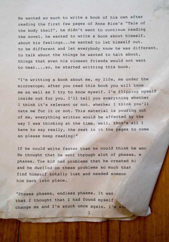
originaldivine
Page 1.

I’ve got it all wrong! Totally somehow forgot that my book DIVINE was created as a memory container; glancing at the artwork would trigger the pages I wrote back in high school. Turns out I’ve got pages and pages of rawness all done on a typewriter. This is page 1. Looking at page 1 of the book I can see I’ve left a lot of the text out of the book. I’m now thinking I have to re-read what I wrote on the typewriter, and not the illustrated “memory container” that I have hardbound before me.

Posted in Design | Leave a comment

BA Design UNSW COFA – Umbrella Philosophy 1996

design_umbrella_philosophy

design_umbrella_philosophy_2

Finding good stuff in my memory container (big plastic box of old diaries, letters, photos and more from the late 80’s to late 90’s). This one is a UNSW COFA Design Umbrella Philosophy I wrote when I was 20. I remember my lecturer at the time shaking his head when I read out the kissing analogy; I kinda stopped presenting and asked why, he said something along the lines of “only you Justin would be able to think of something like that”, was a relief so I ended up reading the rest of it out quite confidently!

Posted in Design | Leave a comment

Hangs with the Midnight Garage Crew

before
BEFORE (raw unedited).

after
AFTER.

before1
BEFORE.

after1
AFTER.

midnightgarage_grid
Their logo design is way out of whack as you can see now that I’ve put a grid over it.

I hung out with the young guys from Midnight Garage yesterday. They’re good dudes who have always supported ZEN and EOMM. A little while back they started their own brand “Midnight Garage” and so far the guys have come up with a logo and have started to shoot at automotive events.

We had a good catch up, and ended up talking about all sorts of stuff (I might get these guys on the podcast at some point!), but I thought I’d take the time to show them how I frame in hopes it would rub off on them. Will gave me his memory card of shots from a meet the night before and I picked out both shots above to re-frame.

The top image is pretty straight forward, but just a note that it’s always better to shoot a few steps back at car meets rather than being so close you end up cropping parts of the car you’re shooting (which he had done in a fair few shots).

The second image was one of his worse images on the SD Card but hey my slight rotation and crop shows how you could sometimes even save a bad image with a little dynamic framing.

Now the logo file; I knew it wasn’t tight just looking at it, but I thought I’d explain why to the guys by putting it into photoshop then layering a grid over it. As you can see nothing lines up at all. The CREW is off centre, the left little octagon is too. The crew banner edges have different angles both the left and the right and the 3 lower case g’s look super repetitive and make this hand written style font obviously look like a font (a capital G would have been better for Garage). The way the triangle crops around the letters isn’t working either as it’s almost dynamic on the left side, but cut horizontally straight on the right side.

I made sure the guys realised that I was in no way at all having a go at their designer, he’s a junior/young and I’ve got way more experience, but it was awesome to be able to show the guys exactly why the logo didn’t look right to me. Once they saw all the things I saw they were taken aback (I mean these guys already have printed out stickers and T-Shirts of their logo too and they didn’t see all the faults that I saw).

Whilst I’m damn tempted to refine their existing logo (as it only needs a few tweaks here and there to make it a lot tighter) I’m thinking that I’ve got to stop being so generous in order to avoid those nasty resentment issues of mine!!! The guys are totally onto it in any case. I’m sure they’ll sort the logo out and I’m also sure their shots will be framed nicer going forwards too.

Like: https://www.facebook.com/midnight.garage.aus/

Posted in Cars, Design | Leave a comment

ZEN PODCAST #008 – Design Talk

In this podcast I do the intro part of an hour long motivational/inspirational design talk I do at design schools all over Sydney.

Note: This is the first video I’ve made with Premiere, which is a LOT more complex than iMovie that’s for sure! The video looks to be the wrong format, and the file has ended up being massive in size (making for a VERY slow upload). I’ve not bothered with any transitions as I couldn’t figure it out intuitively and there’s no intro or outro. I’ve tried to synch the audio track to the footage and it’s come out better than the previous iMovie vids in that regard but it’s still out of whack.

I’ll get there!

PS: ZEN PODCASTS are also on SoundCloud: https://soundcloud.com/zengarage/zenpodcast-008-design-talk?in=zengarage/sets/zen-podcasts
And on iTunes: https://itunes.apple.com/au/podcast/zen-podcast-001/id1336686598?mt=2

Posted in Design, Podcast | 2 Comments