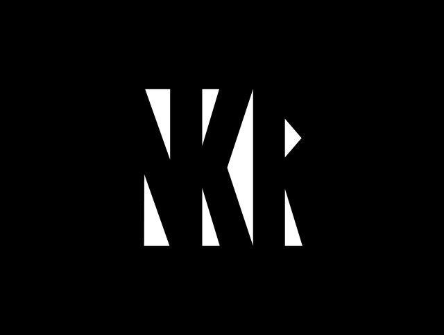
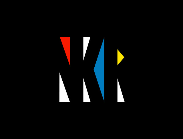
Had a lot of fun designing a logo for Nathan Kumar. Liked the first (top 2) designs, but went next level with the “bunch of triangles” logo. I like pushing letters, but this one’s pushed pretty damn far as the entire logotype is a negative space logo. We’ve not nailed colours down yet, but you can see a Mondrian inspired colour scheme which shows how flexible the triangles are. The logo at the very bottom spells it out, but I think the NKR works best alone.
We’ve still got to work on a mascot design for Nathan “The Black Mamba” Kumar. That’s to go on the back of his helmet! More updates soon!

